Lately, I’ve been hunting for a house. With the birth of my daughter, my husband and I have realized we need a bigger living space. In our search, we’ve started to ask deeper questions like, “What kind of house compliments our lifestyle?” or “How does our home align with who we are?” For instance, spending time outside is one of our values, so we’ve been looking for a house with plenty of windows, in a walkable neighborhood.
Designing a school website is a lot like buying or building a house. Just like a house, it’s easy to dive head-first into the decision process without stopping to think about why you want it in the first place. For example, a young, traveling professional is going to look for a much different type of home than a family that loves to host parties. Similarly, school leaders want different things for their websites. One district may use its website to connect with the broader community, while another may lean on it as the primary tool to communicate with parents and teachers.
Many people assume that creating a sitemap is the first step in building a website, but it’s actually the second. The first step is to know the purpose of your site. When you understand the purpose, everything centers around that narrative. Elements like your sitemap, navigation menu, language, and photography all point back to the larger story you’re trying to tell. After all, your website is more than just a place to share information in a pretty way. It’s a place to reinforce your core message and your brand. In order to do this well, you have to ask yourself a few questions:
- What is the purpose of our website?
- Who are we trying to reach?
- What is our core message?
- What story do we want to tell about our district?
Answering these questions will guide you every step of the way in the web design journey.
Why your school website matters
It only takes 0.05 seconds for a person to form an opinion about a website. That’s not a lot of time to leave a great first impression—and that matters because your school website is the primary house for your brand. Social media and digital advertising have their place, but in these spaces, your brand is competing for attention with hundreds of other voices. Your school website, on the other hand, is just that: It’s yours. There’s an endless amount of opportunity for you to reinforce your identity on your site as opposed to other communications channels.
Here’s a question worth asking: How does your community rally around your district? You may say you can feel it in the air on a Friday night football game. But that’s just one night of the week. What about the other six days? Your community isn’t always in the bleachers or in your school buildings—but they are always on their phones. In our scroll-happy world, many of your brand touchpoints take place in digital spaces. It’s visible for all of us to see and experience with just one click: through your website.
“Your school website is the primary house for your brand. Social media and digital advertising have their place, but in these spaces, your brand is competing for attention with hundreds of other voices.”
Think about it. Families go to your site to access information about upcoming games, the cafeteria menu, and enrollment. Teachers use your website to look for documents. Stakeholders visit your website for school board information and events. Everyone is coming to your site for information. But if you want them to come back, you have to do more than provide information. You must provide a great experience. The best school websites are hubs for community discourse, where stories are exchanged and positive news is shared. Your site is quite literally the place where your audiences converge—where all roads of communication meet.
Not only that, but your website is your most important recruiting tool. In SchoolCEO’s recent teacher satisfaction survey, we found that over 70% of teachers look at a school’s website before applying for a position—but only 7% of respondents agreed in some way that their school’s online presence attracted them to their current position. Additionally, we found that over 65% of teachers have browsed other job opportunities within the past year. That means that:
- We know teachers are currently on the hunt for better job opportunities.
- School websites are where they are going to do their research—and they’re not very impressed with what they’re finding.
- Optimizing your website is your best shot at attracting teachers (and staff) to your district.
There is no better way to engage your community and show off what’s unique about your schools than your website. So how do you optimize it to be the central place to showcase your brand and tell your district’s story? Design it like you would a home: Start with the foundation.
Table of Contents
Chapter 1 Designing the blueprint of a school website
Chapter 2 Building a school website
Chapter 3 Draw the roadmap with SEO
Chapter 4 Make it accessible with
ADA-Compliance
Designing the blueprint of a school website
Let’s safely assume you’ve already bought your domain name, found a good web hosting provider, and picked out a content management system (CMS) you can depend on to help you maintain your site. Once you have these things in place, along with your brand identity assets, you can begin laying out the blueprint for your website.
Imagine someone has offered to build you a home, but on one condition: they refuse to use a blueprint. Unless you’re a fly-by-the-seat-of-your-pants kind of person, you’re probably not going to take the offer. Why? Because a great home comes with a carefully thought-out blueprint—and so does your website. This blueprint is called a sitemap, and it’s one of the most important elements of a school website.
To put this in perspective, here is an example of what a sitemap looks like for a local coffee roasting company:


Sitemaps look a lot like a spider web. The center of the web is your homepage. That’s the place every other page leads back to. Underneath are the pillar pages of your website. These pages encompass a large topic on your site. In the diagram above, Coffee represents one pillar page. For a school district website, a pillar page could be a Schools page, where visitors can learn more about all of the different schools in your district.
The pages listed under a pillar page are supporting pages. In the diagram above, Our Beans represents one supporting page. You’ll often find call-to-action buttons on pillar pages that link to supporting pages. For example, if you’re on a Schools pillar page, you’ll often see call-to-action buttons or links that send you to the individual school pages (i.e. the supporting pages).
Sitemaps can look more complicated than the diagram above—and for school websites, that is often the case—but this is just a basic framework to help you understand the general concept.
The order in which you structure your sitemap can either create a delightful user experience or a frustrating one. Think about walking into your family’s home. The living room is oftentimes one of the first rooms you see because it’s the place where everyone gathers. Imagine stepping across the threshold of a home and immediately setting foot in the master bedroom. Try as you might, you can’t find the living room or the kitchen because they’re tucked away in the corners of the house. There’s no logic or order to a home like that. Similarly, your sitemap needs to take people on a journey that makes sense or you’ll lose people along the way.
Building a school website
Once you’ve laid the foundation of your school website, the next step is to build it.
Design: the living room
What room in your home do you often spend the most time decorating? This isn’t the case for all of us, but most of us would say the living room. As I mentioned earlier, the living room is the place where people gather. It’s also the place guests spend the most time in. The homepage of your school website is a lot like your living room. It deserves the most attention and care. Why? Because it’s the place where people land when they’re visiting your site, whether they’re coming from social media, a landing page, a digital ad, or typing your website directly into the search engine. The homepage of a website is the page that forms our first impression of a brand. That’s why it has to be memorable. So, how can you make that happen?
Place the most important information on the left
Here’s some interesting data: Website users spend 80% of their time viewing the left-hand side of a web page and 20% viewing the right-hand side. If you think about it, this makes sense. After all, we read left to right. An eye-tracking study by Eyequant takes this one degree further. They found that when people land on a webpage, their eyes move from the upper lefthand corner, toward the center of the page, and then to the bottom right. Another study found that people read web pages in an F-shaped pattern.
What do all of these findings tell us? That the left-hand side of your homepage is the most viewed area of your entire website. For schools, this means placing the most critical information—the value proposition—on the upper left-hand side of your homepage. Illinois’s Distinctive Schools does this well.


Their logo is on the top left-hand corner of the page—reinforcing their brand right out of the gate. Below the banner video, you see their tagline on the left, followed by a short description of their mission statement. As you design your school website, think about placement. Think top left to bottom right.
“The left-hand side of your homepage is the most viewed area of your entire website.”
An eye-catching banner image or video at the top
People will spend 5.94 seconds on average looking at a site’s main banner image. In our digital, scroll-happy world, almost six seconds is a long time. That’s why it’s important to have an attention-grabbing banner image or video at the top of your homepage. What does that mean for your school website? Whether it’s in the form of a video or banner image, showcase crisp, clean imagery of people in your district.
Authenticity is key here. Digital marketing researcher Jakob Nielsen found that when users are on a website, they want to look at imagery of real people. Users are less likely to pay attention to stock photography images, even if those images contain people. Washington’s Enumclaw School District understands this.
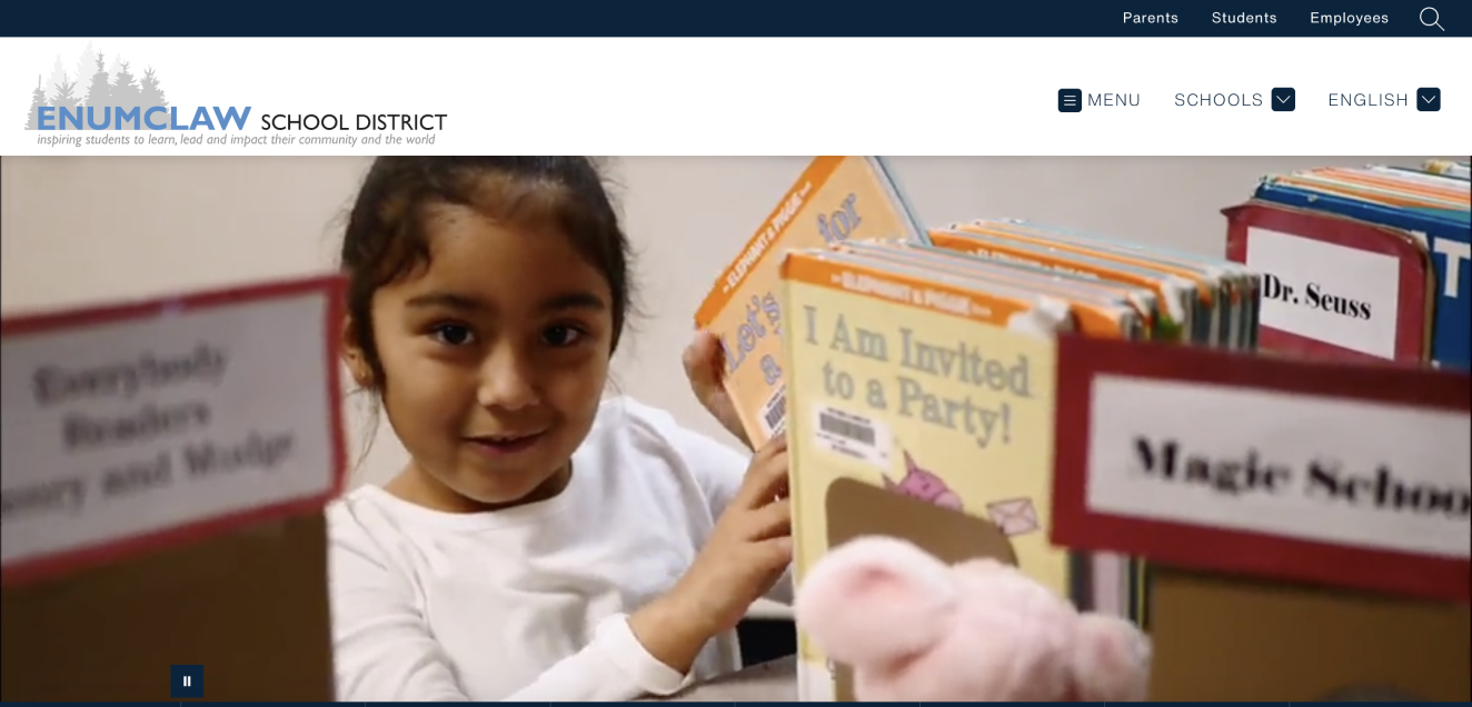
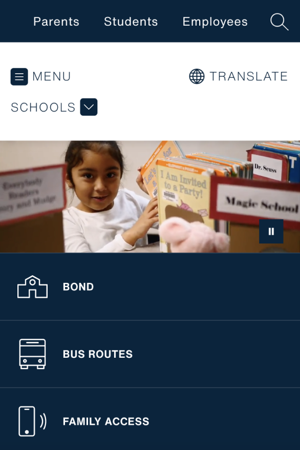
Their banner video makes you feel like you’re immersed inside the walls of their schools. It authentically captures the everyday life of their students and teachers.
A thoughtful navigation menu
A survey by Clutch asked 612 people what website user experience features matter most to them. The result? Around 94% of respondents said that easy navigation is the most important feature. That’s huge intel for schools. People want to find information on your website quickly and easily. Your navigation menu is their roadmap to finding that information. It’s also the best opportunity for you to place your most important pages—like your enrollment and employment pages—front and center for your audience. Take Nebraska’s Columbus Public Schools, for example.
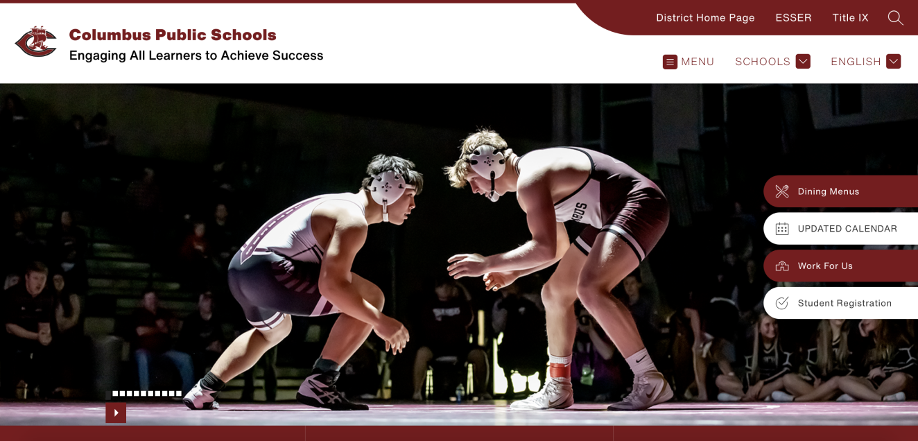
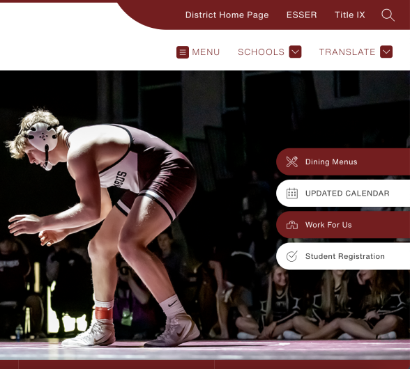
You can easily access their menu and schools at the top of the page. But beyond that, they’ve also listed their most important pages as call-to-action buttons on the top right: Dining Menus, Calendar, Employment, and Student Registration. When it comes time for families to enroll, or teachers to apply for a job, CPS has made it a smooth and easy process. Just keep in mind that people spend the majority of their time looking at the upper left-hand side of your website. While call-to-action buttons are great elements to add on the right-hand side of the page, think about placing your core message on the left-hand side.
“People want to find information on your website quickly and easily. Your navigation menu is their roadmap to finding that information.”
Live Feed & News
The intangible aspects of your brand are the stories your community shares about your district. These stories help form a positive perception of your brand, build advocates, and improve parent-teacher communication. Since your website is the central place to experience your brand, it needs to have a dedicated space to share stories.
Stories are the best way to keep everyone up-to-date with what’s happening in your district. With Live Feed and News, each story becomes an opportunity to reinforce your school's strengths.
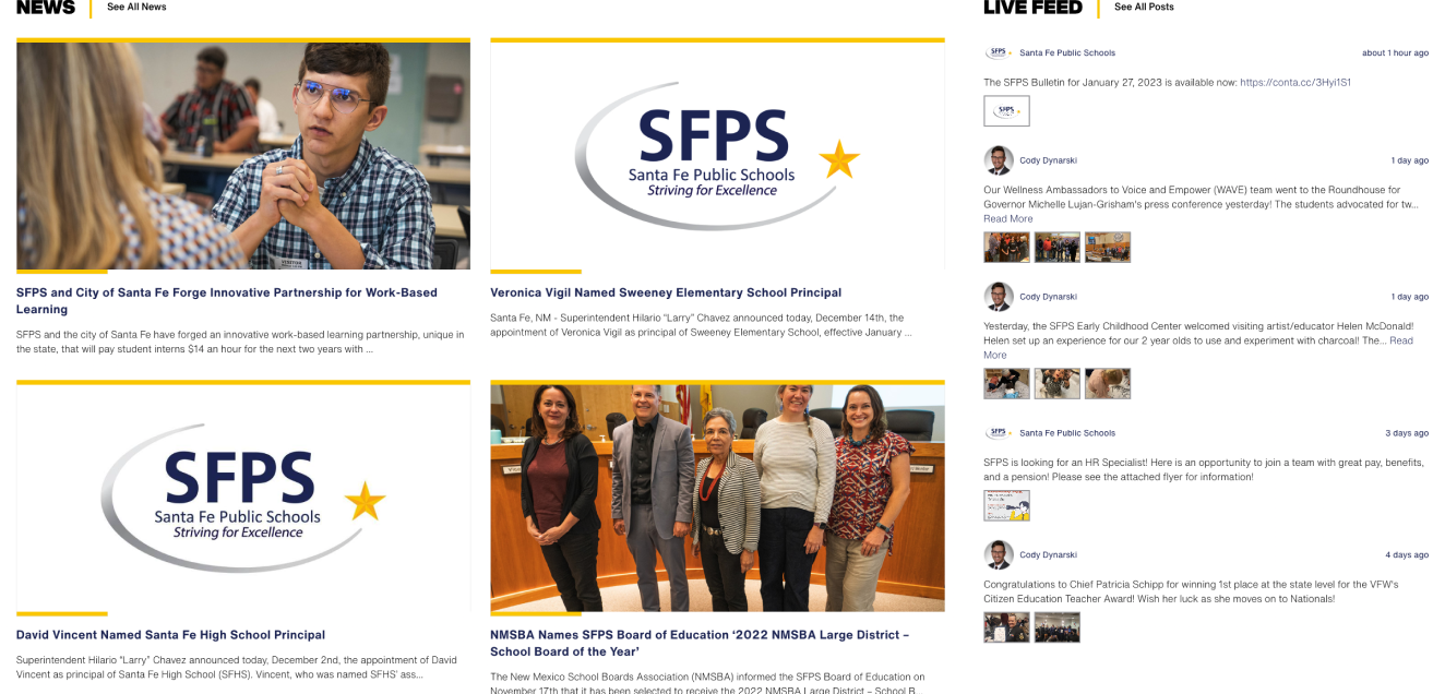
A few ways you can do that is by adding a Live Feed and News section on your homepage. A Live Feed is a place where you can post quick, condensed updates about what’s happening in your schools. It essentially looks like a feed full of social media posts—short and to the point. As the name implies, News is a section on your homepage that lists districtwide news. Unlike Live Feed, News posts tend to be more detailed and longer in length. Santa Fe Public Schools in New Mexico lists their News and Live Feed side by side on their homepage.

Once you’ve built a powerful homepage, you can begin building all of the other pages on your website. It helps to refer to your sitemap during this process. First, start with the pillar pages and work your way down to the supporting pages. While some of the topics we discussed above don’t necessarily apply to pillar and supporting pages, some concepts hold true, like making sure your most important content is on the upper left-hand side of the page. And of course, always include high-quality, authentic imagery of your people.
Content: filling the rooms
After the homepage is finished, you can begin writing and designing the other pages on your website. Just like every room in your house, every page has its purpose. Each page is an opportunity to do more than just share information. It’s a chance to highlight your culture, your brand, and all of the unique qualities of your district.
Take your employment page, for example. You could use your employment page to share current job openings—or you could do so much more than that. Take this as an opportunity to share why someone should join your district. In our recent teacher satisfaction survey, we found that geographical location, school culture, and school leadership are the top three factors teachers care about most when looking for jobs. Your careers page is an opportunity to talk about these things.
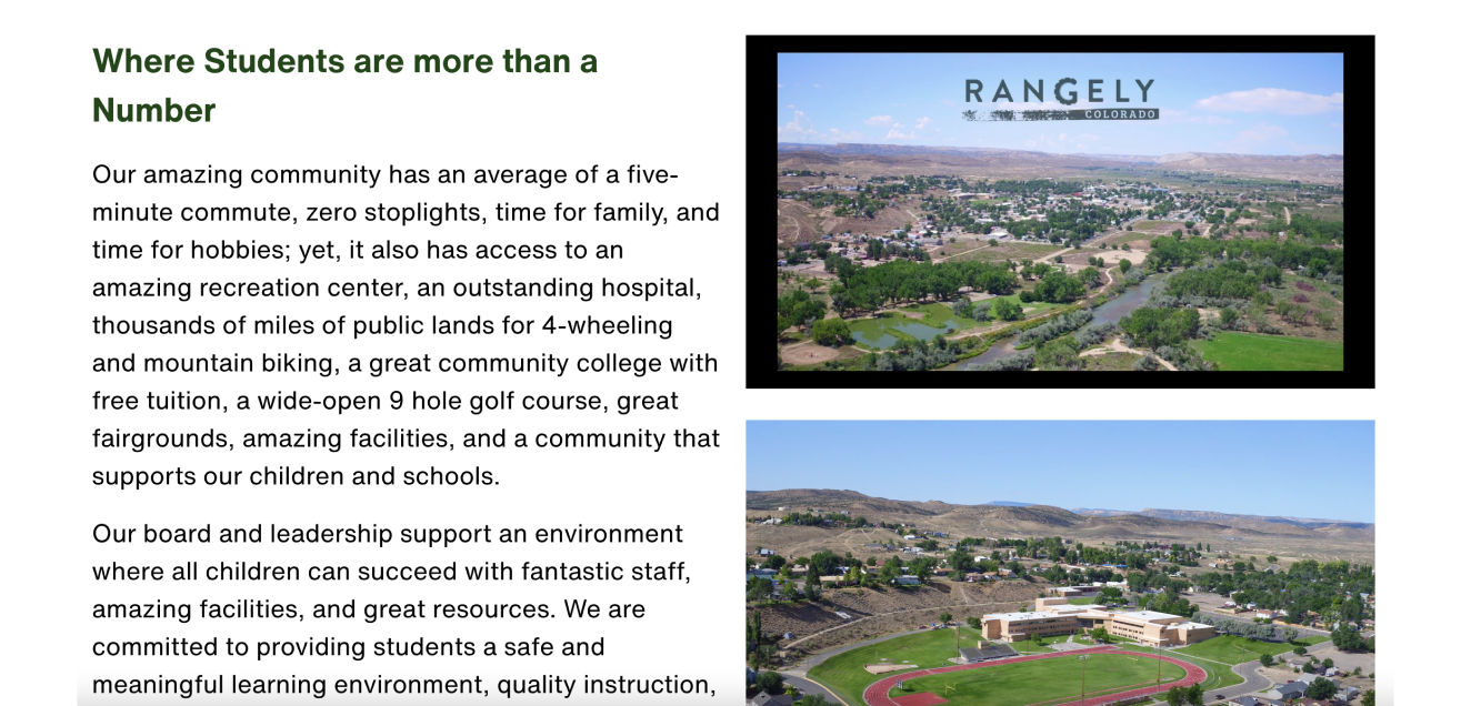
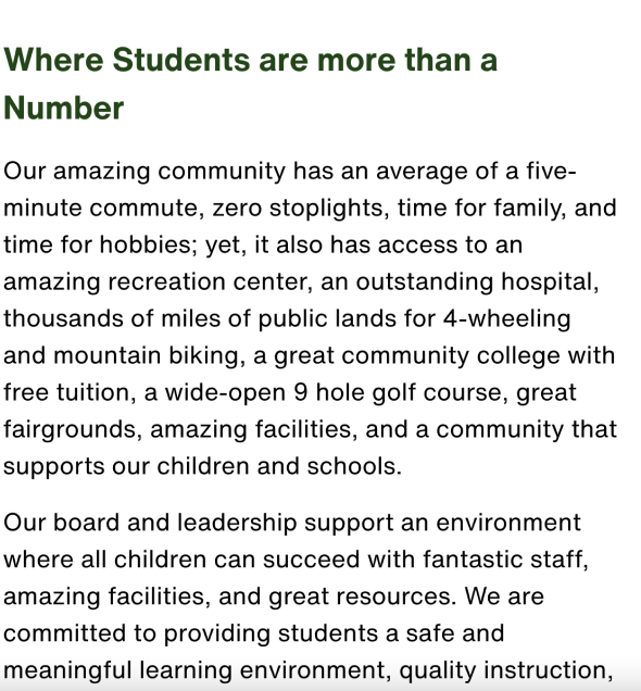
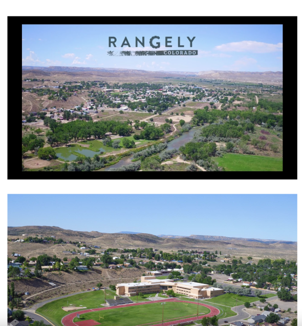
Rangely School District RE-4 in Colorado does this well. While they touch on salary and benefits on their employment page, they also showcase their values, staff testimonials, and what it’s like to live in their community.
Your enrollment page is one of the most vital pages on your website. Enrolling kids in a new school is one of the biggest decisions families have to make. Some families end up relocating to a whole new city just to enroll their children in the right district. When you’re building your enrollment page, your content has to speak directly to this audience. For example, Roxboro Community School in North Carolina shares videos from students and parents about what it’s like to be a part of the RCS community. If you scroll farther down the page, you’ll see a list of alumni profiles on what alumni are up to today.
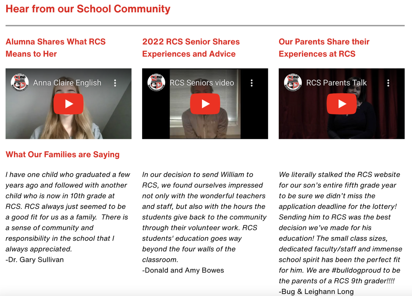
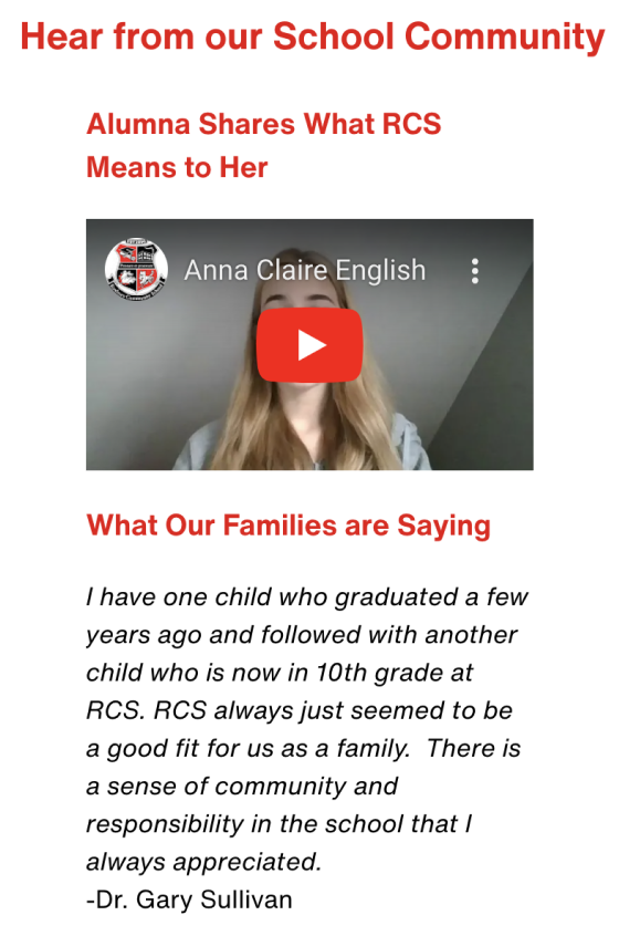
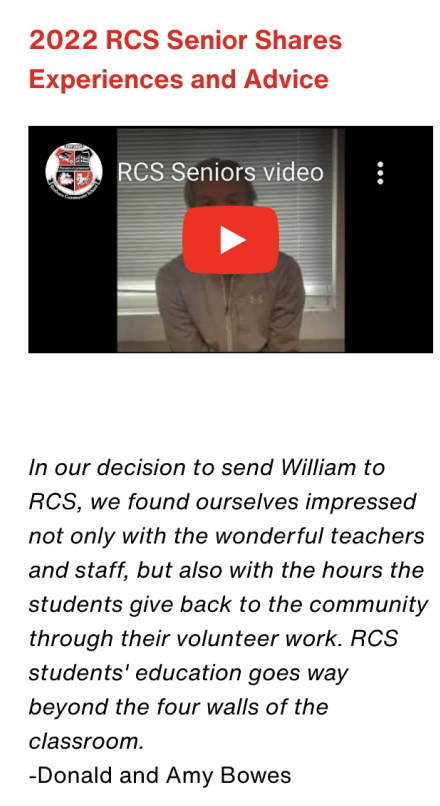
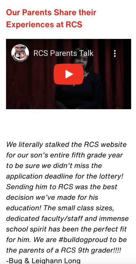
The main takeaway is this: As you design the pages of your website, think beyond just sharing information. When you design a room in your home—say your kid’s bedroom—you’re not going to just place a bed and a chair in an empty room. Why? Because you care about creating an optimal living environment for your child, and you want to fill it with things they care about. Great rooms take time and attention, and the same is true for your website. Design it in a way that will create the best experience for your audience—that makes them want to come back over and over again.
Read The What and Why of School Websites | We analyzed 700 homepages to see what they include—and what’s missing.
Draw the roadmap with SEO
Your website is only effective if people can find it. Imagine inviting a new friend over for dinner without sending them your home address. Likewise, your school website has to be easy to find on the web. This is where SEO or search engine optimization comes into play. SEO is the practice of optimizing a website to increase visibility on search engines, like Google.
You might be thinking: Our community already knows how to find our website. How is this relevant to us? While your internal community—that is, families, staff, stakeholders, and students—know how to find your site, your prospective community doesn’t. SEO is a tool to attract new audiences to your district.
So, how exactly does this work? Search engines use bots to collect and store information about your website. When this process happens, if your site isn’t optimized for SEO, it can hurt your ranking on search engines. There are several different factors that makeup SEO: keywords, backlinks, mobile-friendly, and a thoughtful sitemap, among other factors. Keep these things top of mind as you’re designing your site.
Keywords
Keywords are a series of words people use in search engines to find services related to your schools. You want your website to rank at the top of the search engine results page for these keywords. To put this in perspective, say you’re a school district in Nashville, Tennessee, and you’re known for your amazing online and STEM programs. Here are a few keywords you might want to optimize your website for:
- School district in Nashville TN
- School in Nashville
- STEM program in Nashville TN
- STEM program in Nashville
- Online school in Nashville TN
- Online program in Nashville
When you’re optimizing your school website, you need to use these keywords and variations of them in a variety of places, like the body text, meta description, URL path, titles, subtitles, and image alt texts.
Backlinks
Backlinks are links from one website to another website. Backlinks are votes of confidence for your site. The more backlinks you have from other websites, the more credible your site looks in the eyes of search engines. Backlinks are similar to five-star reviews for a restaurant: The more you have, the more legitimate your business—or in our case district—looks.
But not every backlink is created equal. Backlinks from government websites (.gov), universities (.edu), and organizations (.org), carry more weight than links from domains like .com and .net. That’s because blogs and spammy accounts are more likely to come from .com or .net domains.
Growing your backlink profile isn’t an overnight process. But there are a few easy ways you can start:
- Add your school website to local listings sites.
- Ask chamber of commerce websites to link to your website.
- When you launch a press release, ask news sources to include a hyperlink to your website in their article.
- Reach out to local organizations your schools have partnered with and ask them to link to your website through their blog, partner page, or news articles.
Mobile-friendliness
Back in 2020, Google announced that it would be switching to mobile-first indexing. In layman's terms, that simply means that Google now prioritizes the mobile version of your website above the desktop version. Why? Google’s ultimate goal is to provide a great user experience for people, and since we’re all using our phones more than our desktops to browse the web, that means creating a great user experience on mobile.
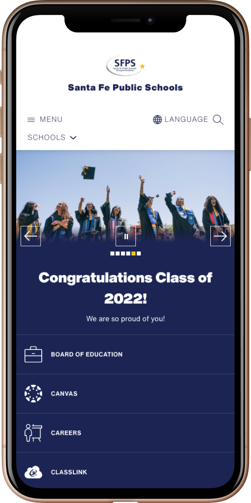
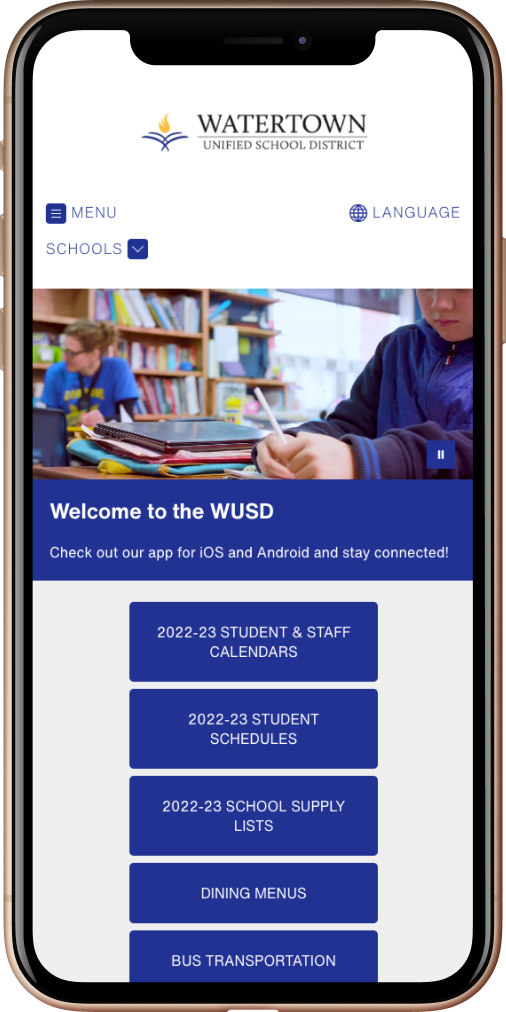
What does this mean for schools? It means that your website needs to be responsive. Responsive design scales your website content—including graphics, pictures, buttons, and text—to fit any screen size. This prevents users from having to pinch and zoom to read your site’s content. As you’re designing your school website, browse through the pages on your phone and make note of any frustrations you might encounter, like a button that’s too small, a link that doesn’t work, or a picture that doesn’t scale right. These are the types of things you’ll want to adjust to make your site mobile-friendly.
Sitemap
Let’s talk about your sitemap, again (aka the blueprint of your website). I touched on the user experience component of your sitemap earlier—that your sitemap has to be structured in a way that makes sense to users. But sitemaps aren’t just constructed for people—they’re constructed for bots, too. Search engines, like Google, use bots to find, crawl, and index all of the pages on your website using your sitemap. This helps search engines prioritize which pages on your site are most important. This is an essential part of SEO because it signals to Google that your website is live which increases its visibility on the web.
Make it accessible with
ADA-Compliance
A home—or any building for that matter—is only as good as it is accessible. How horrible would it feel if something was blocking or preventing you from being able to walk inside your own home? This is how people with disabilities feel if your website isn’t ADA-compliant. The Americans with Disabilities Act (ADA) ensures that “places of public accommodation,” like your school website, are made accessible to Americans with disabilities. There are four disabilities protected by the ADA: auditory, visual, motor, and cognitive.
Adding transcripts to videos, alt tags on images, and formatting your website for screen readers are all important ways you can keep your site ADA-compliant (among other factors). If your website isn’t up to ADA compliance standards, not only are you failing to serve your school community, you could receive an accessibility violation from the Office for Civil Rights (OCR).
Navigating ADA website compliance is a complex process but we can walk you through it.
Read The No Fear Guide to K-12 ADA Compliance for School Websites
Monitoring your school website performance
Now you’ve laid the foundation, built pages, and optimized your site for SEO and ADA compliance. The last step in the web design journey is to monitor your site’s performance.
To start monitoring your website you’ll need to set up a Google Analytics account and add a Global Site Tag to your website. Google Analytics is a free tool that can help you understand the customer journey and monitor site traffic.
If you’re already familiar with this tool, you may have noticed Google has introduced a new version of their platform called Google Analytics 4 or GA4. Websites that are still using the old version of the platform will have to make the transition to GA4 by July 1, 2023.
There’s an endless amount of ways you can use GA4. For the purpose of this guide, I’ll just go over a few basic metrics I like to use. The first thing we’ll look at is the Reports snapshot. It looks like this:
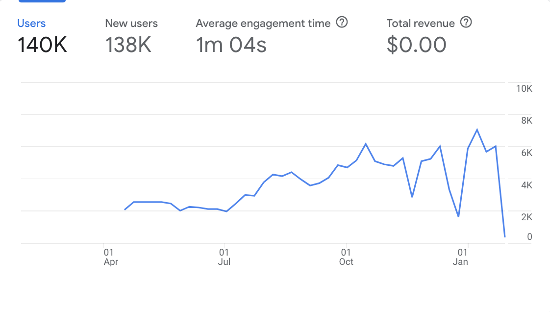
Here’s what these metrics actually mean:
Users | The number of individuals that visit your website
New users | The number of new individuals that visit your site
Average engagement time | The average time an individual spends on a page
Total revenue | The sum of revenue from purchases or subscriptions. (You won’t have to worry about this number since schools are not e-commerce websites.)
This is the most important snapshot on GA4 because it shows you how many people are visiting your website at a given time. The more visits you have, the more exposure your community has to your brand.
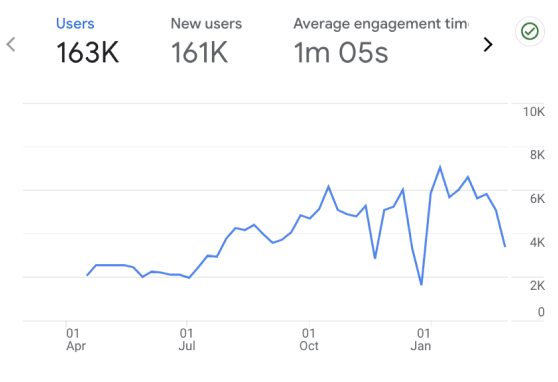
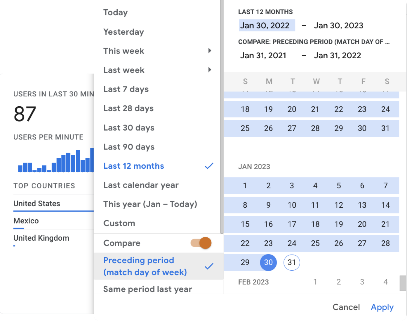
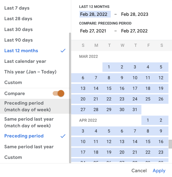
You can also change the date in the upper right-hand corner to compare timeframes. I recommend analyzing a wider timeframe, like a year-over-year comparison. The wider the timeframe is, the more accurate picture of growth you’ll find. That being said, you’ll only be able to look at data from the time you switched over to the GA4 platform. For Apptegy, that was back in April 2022, which is why the snapshot above begins in April.
Where do your new users come from? is another interesting snapshot to look at. This shows you how people get to your website. Users can find your site through many different avenues:
Organic Search | Website traffic that comes to your site through unpaid efforts. Oftentimes this traffic comes from keywords and other SEO efforts.
Direct | Website traffic that comes to your site through a direct URL. Direct traffic usually comes from people who are already familiar with your brand and site.
Referral | Website traffic that comes to your site from links that appear on a different website.
Social Media | Website traffic that comes to your site through social media.
Paid | Website traffic that comes to your site through paid efforts.
Email | Website traffic that comes to your site through email marketing.
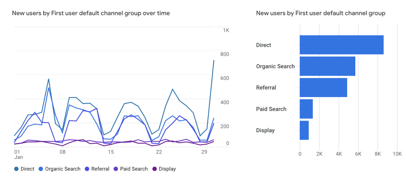
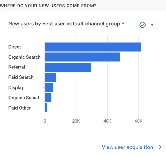
Once you understand where users are coming from, this can help guide your marketing efforts for the future. For instance, if you find that most people are coming to your website through direct channels, you can safely assume these are people that already know about your brand. These would be people like teachers, families, and staff. That means you could try testing out different ways to reach others that aren’t familiar with your district, like prospective teachers and families.
Here’s another example. Say you just launched a back-to-school campaign on social media. If you look at your analytics since the time the campaign was launched and found that your social media traffic increased from the previous time period, you can safely assume your back-to-school campaign performed well. On the other hand, if you noticed your social media traffic decreased or stayed the same since the time you launched your campaign, it might be a sign that you should try a different promotional approach.
The last channel I’ll touch on is Views by Page Title and Screen Class. This is where you can look at which pages are performing best on your school website. The difference between Views and Users is that Users represent the number of people visiting a page. Views represent how many times they looked at that page.


A fan favorite for school leaders, this snapshot helps you narrow down your best and worst-performing pages. This is helpful when you’re trying to decide which pages need the most attention. Say you’re running an enrollment campaign that directs people to your enrollment page. When you use the Page Title and Screen Class tool, you can monitor the traffic on that page which will help you understand how well that campaign is performing.
Bonus tip: If you’re ever confused about what a metric means, just hover over it with your mouse and the definition will appear.
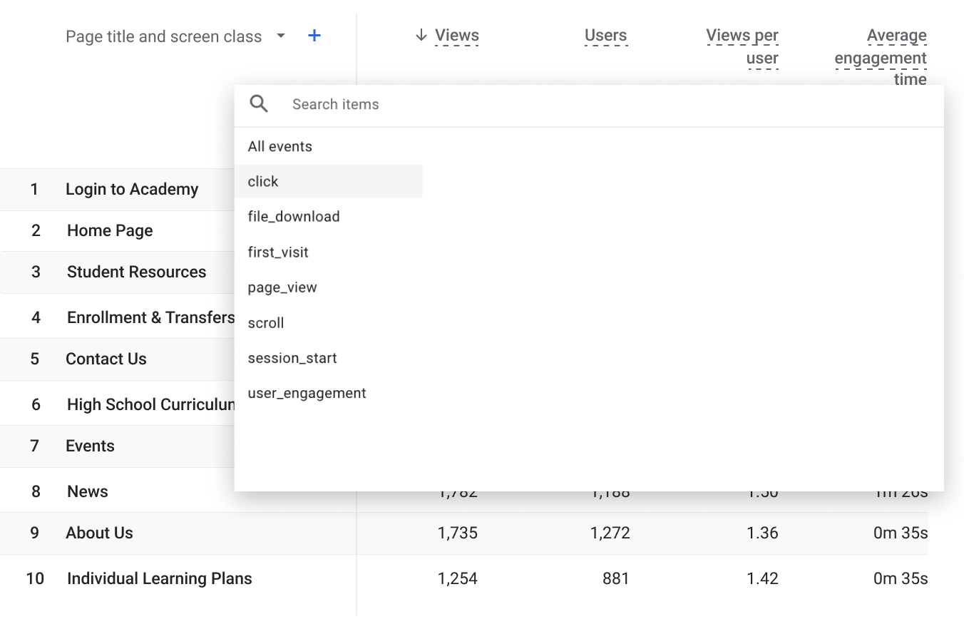
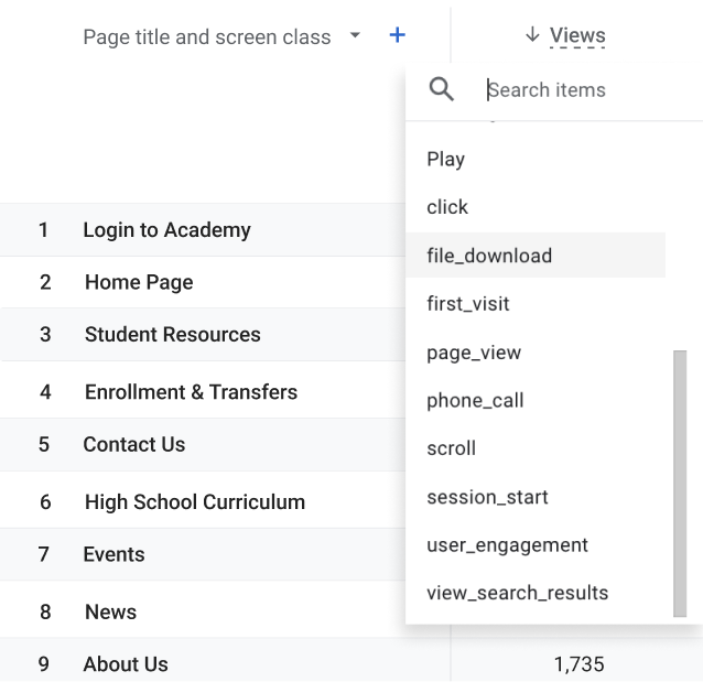
One last thing: If you scroll over to Event count and click the down arrow, a list of Events will pop up. This metric can be helpful when you’re trying to track how many people clicked on a call-to-action button or downloaded a form on a landing page. For instance, you might have a downloadable PDF on your employment page outlining the interview process. If you go to Events and click “file_download”, you’ll be able to see how many prospects downloaded your PDF. See the screenshot below.
There are so many other ways to use GA4. My recommendation is to dive head first—experiment, play, and mess around with the tool. It’s highly unlikely you’ll break it.
Here’s the truth: There is a lot more to building and monitoring a school website than this. Moving a website can feel like sitting down to a 1,000-piece puzzle. Sometimes it’s overwhelming but you don’t have to go at it alone. It takes a village to do the work. Our team of developers, designers, and onboarders would love to come alongside you on this journey.
Your site is worth every ounce of effort you put into it. There is no better tool to tell your district’s story and control the narrative around your brand. Now that you understand the basic building blocks of creating a website, you’re already one step ahead of the game. The best part is, your site isn’t going anywhere. Whether you’re launching a new website or modifying an old one, at some point or another it’ll need remodeling—just like a home. Don’t dread the process. Instead, take it as an opportunity to flex those creative muscles. All of the work you put into your school website will come back to you because it’s the place where your community gathers. It’s where your brand lives.
Read more Apptegy resources
The Comprehensive Guide to School Branding
How to build a powerful school brand.
Our teacher satisfaction survey spanned generations
In the largest study of its kind, we asked educators what they look for in a job and how schools can improve their teacher recruitment.
Showcase your location on your school website
Location is a major factor in teacher recruitment and school enrollment. Are you marketing yours effectively?
